CSS Language
CSS (Cascading Stylesheets) is used to define the style of a webpage. Think of it like the choice of paint, wood, window curtains, etc. when building a house. When you visit a website, the CSS is what the gives the webpage its fancy design!
We use CSS in the following courses at CWHQ:
| Elementary | Middle School | High School |
|---|---|---|
| Fundamental Programming Concepts | Webpages with HTML & CSS | Fundamentals of Web Development |
| Web Development For Kids - 1 | Capstone 1 | User Interface Development |
| Web Development For Kids - 2 | User Interface Development | Capstone 1 |
| Creating Websites with HTML/CSS | Responsive Web Development | APIs and Databases |
| Responsive Websites with HTML/CSS | Interactive JavaScript | Professional Web App Development |
| Interactive Websites with JavaScript | Web Interfaces | Modern CSS Frameworks |
| Capstone 3 | Capstone 2 | Capstone 2 |
| Mastering APIs | Mastering MVC Framework | |
| Capstone 3 | Object Relational Mapping | |
| DevOps and Software Engineering | ||
| Capstone 3 |
In this section of our documentation, you'll find references to most of the core CSS language features that we use in our CodeWizardsHQ courses.
You'll also find many Further reading sections, which pull from these excellent CSS resources:
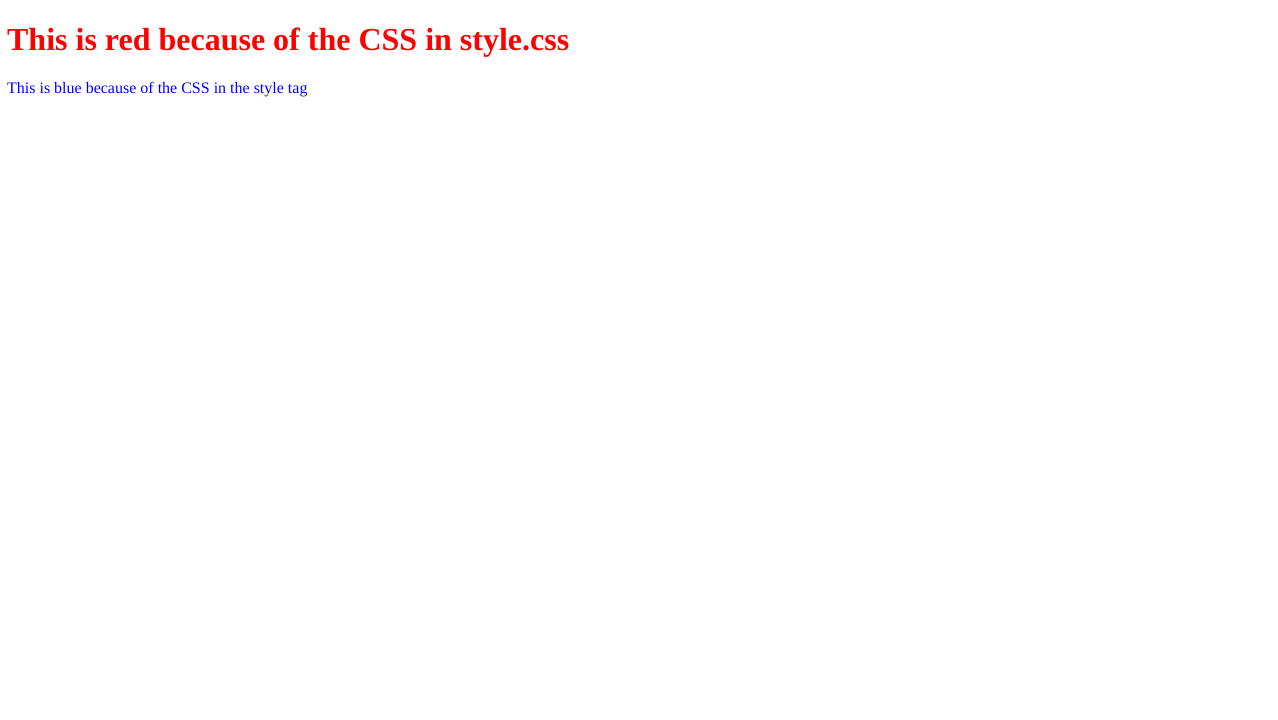
Including CSS In HTML Documents
In order for CSS style rules to apply to an HTML document, you must include them in the document in some way.
Including CSS In The <head>
Generally, CSS is added in the <head> of an HTML document. You can link an external CSS file using a <link> tag, or you can write CSS directly in an HTML document using the <style> tag. Both methods are shown below.
/* style.css */
h1 {
    color: red;
}
<!DOCTYPE html>

<html>
    <head>
        <title>Including CSS in HTML Documents</title>
        <!-- This is an external stylesheet -->
        <link rel="stylesheet" href="style.css" />
        <style>
            p {
                color: blue;
            }
        </style>
    </head>

    <body>
        <h1>This is red because of the CSS in style.css</h1>
        <p>This is blue because of the CSS in the style tag</p>
    </body>
</html>
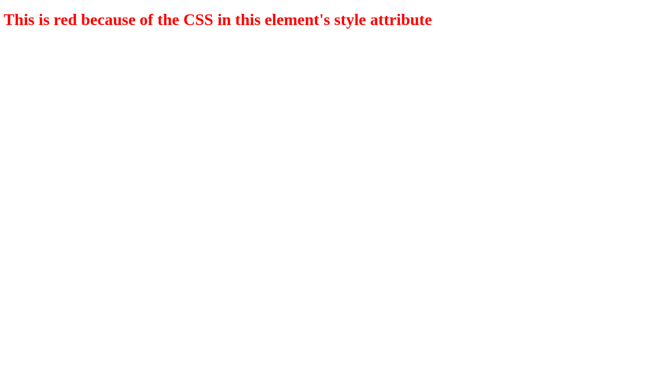
Inline CSS
You can also write CSS style rules directly in an HTML tag using the style attribute, but this is generally discouraged.
<!DOCTYPE html>

<html>
    <head>
        <title>Including CSS in HTML Documents</title>
    </head>

    <body>
        <h1 style="color: red;">
            This is red because of the CSS in this element's style attribute
        </h1>
    </body>
</html>
Further Reading
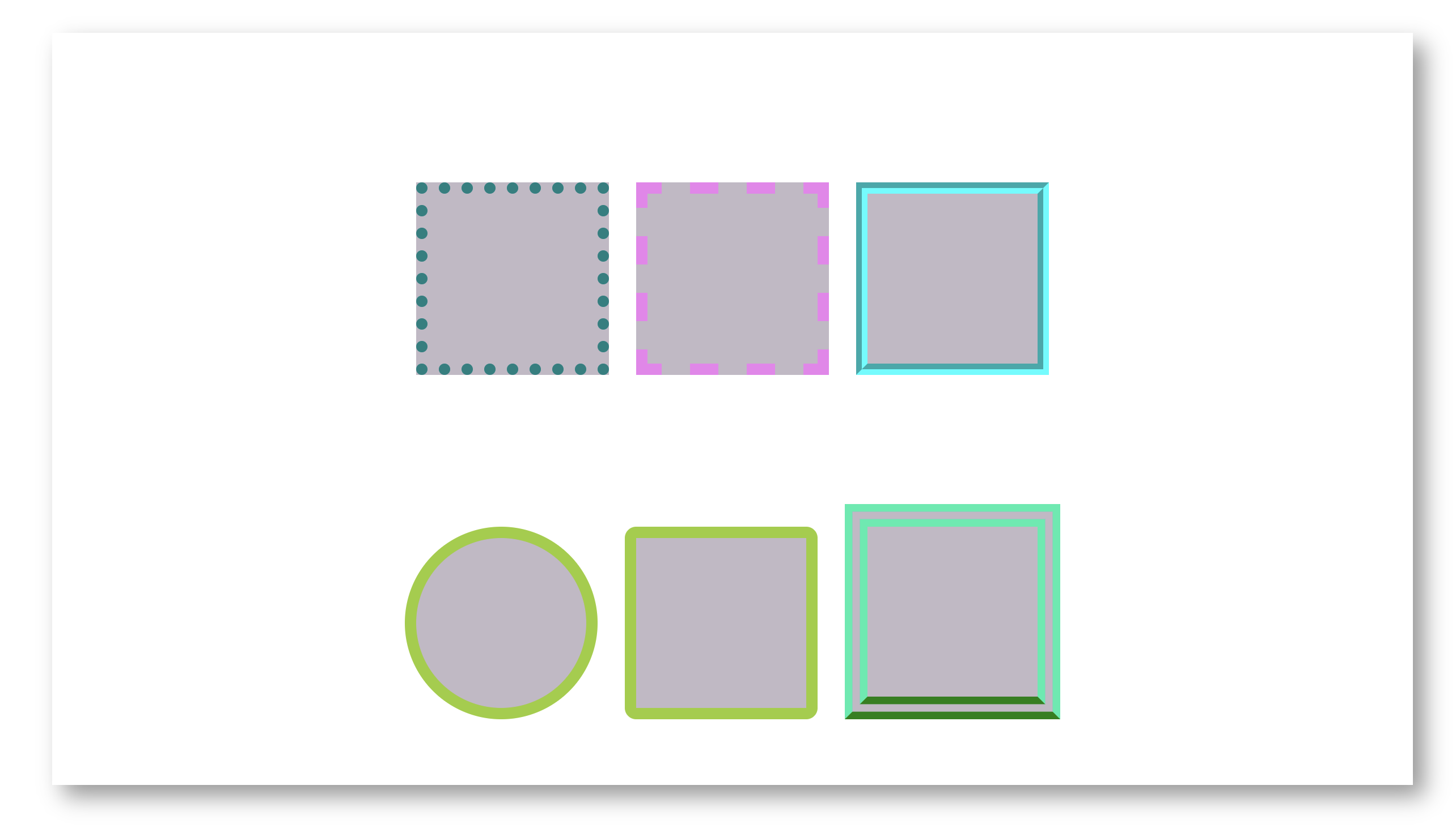
Borders
The border property can create a styled border for elements. Below are some border examples:
<!DOCTYPE html>

<html>
    <head>
        <title>Borders</title>

        <style>
            .box {
                width: 150px;
                height: 150px;
                border: 10px solid yellowgreen;
                display: inline-block;
                margin: 10px;
                margin-top: 100px;
                background-color: rgba(176, 166, 181, 0.787);
            }

            .box-1 {
                border: 10px dotted teal;
            }
            .box-2 {
                border: 10px dashed violet;
            }
            .box-3 {
                border: 10px groove cyan;
            }

            /*
            border-radius property can be used to round edges
            or make a complete circle for an element
            */
            .box-4 {
                border-radius: 50%;
            }
            .box-5 {
                border-radius: 10px;
            }

            /*
            Below are some longhand border properties
            */
            .box-6 {
                /* Border Style Longhand */
                border-style: double;
                /* Border Width Longhand */
                border-width: 20px;
                /* Border Color Longhand */
                border-color: rgb(24, 237, 173);
                /* Border Bottom Longhand */
                border-bottom: 20px double green;
            }
        </style>
    </head>

    <body>
        <div class="container">
            <div class="box box-1"></div>
            <div class="box box-2"></div>
            <div class="box box-3"></div>
            <div class="box box-4"></div>
            <div class="box box-5"></div>
            <div class="box box-6"></div>
        </div>
    </body>
</html>
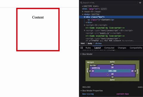
Box Model
The box model is used by every HTML element. The box model has margin, border, padding, and content and is used to form a visual "box".
<!DOCTYPE html>

<html>
    <head>
        <title>Box Model</title>
        <style>
            .box {
                margin: auto;
                border: 10px solid red;
                padding: 20px;
                text-align: center;
                width: 300px;
                height: 300px;
            }
        </style>
    </head>

    <body>
        <div class="box">
            <p>Content</p>
        </div>
    </body>
</html>
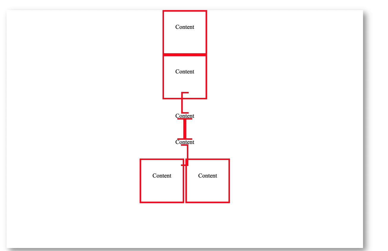
Block and Inline
The terms block and inline refer to two different types of boxes. The width and height properties can be used on elements with the display property set to block (which is also the default display property). If the value of an element is inline, the box will not break on a new line, and the width and height properties will be ignored.
<!DOCTYPE html>

<html>
    <head>
        <title>Box Model</title>
        <style>
            .box {
                margin: auto;
                border: 5px solid red;
                padding: 20px;
                text-align: center;
                width: 300px;
                height: 300px;
            }
            .inline-box {
                display: inline;
            }
            .block-box {
                display: inline-block;
            }
        </style>
    </head>

    <body>
        <div class="box">
            <p>Content</p>
        </div>

        <div class="box">
            <p>Content</p>
        </div>

        <div class="box inline-box">
            <p>Content</p>
        </div>

        <div class="box inline-box">
            <p>Content</p>
        </div>

        <div class="box block-box">
            <p>Content</p>
        </div>

        <div class="box block-box">
            <p>Content</p>
        </div>
    </body>
</html>
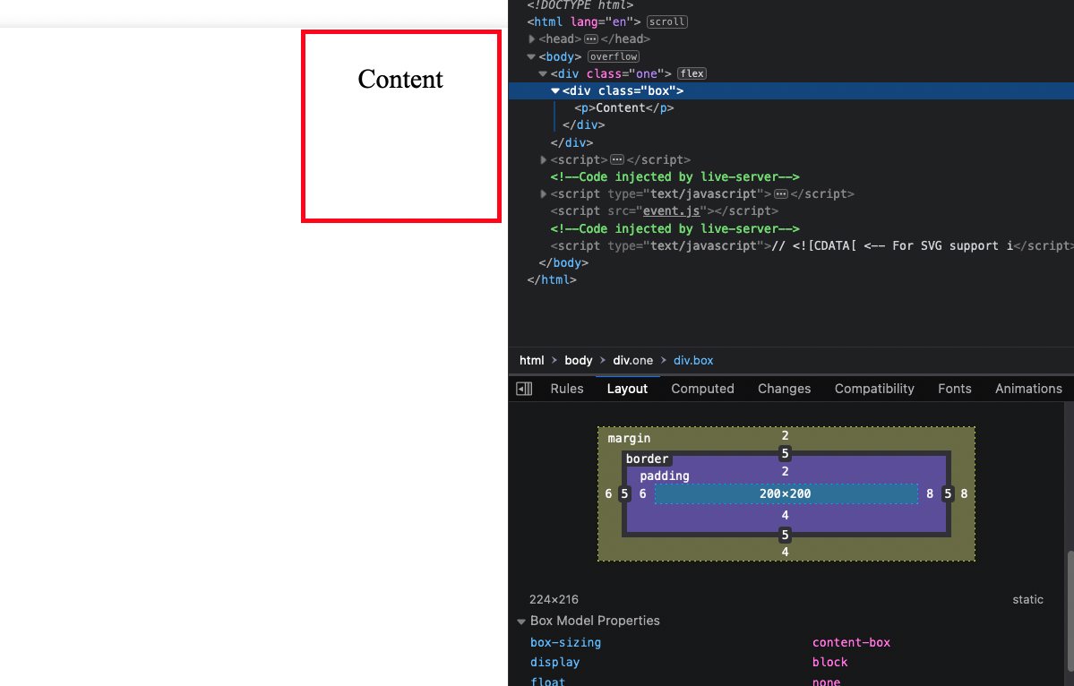
Longhand Properties
Margin and Padding can also be used to create specified spacing using the longhand properties:
<!DOCTYPE html>

<html>
    <head>
        <title>Box Model</title>
        <style>
            .box {
                border: 5px solid red;
                padding: 20px;

                text-align: center;
                width: 200px;
                height: 200px;
                font-size: 30px;
                /*  Margin Longhand Properties */
                margin-top: 2px;
                margin-bottom: 4px;
                margin-left: 6px;
                margin-right: 8px;
                /*  Padding Longhand Properties */
                padding-top: 2px;
                padding-bottom: 4px;
                padding-left: 6px;
                padding-right: 8px;
            }
        </style>
    </head>

    <body>
        <div class="box">
            <p>Content</p>
        </div>
    </body>
</html>
Further Reading
Comments
In CSS you can create comments between /* */ blocks. They can be single line or multiline.
<!DOCTYPE html>

<html>
    <head>
        <title>CSS Comments</title>
        <style>
            /* This is a single line comment */

            /*
            This
            spans
            multiple lines
            */
        </style>
    </head>

    <body></body>
</html>
Further Reading
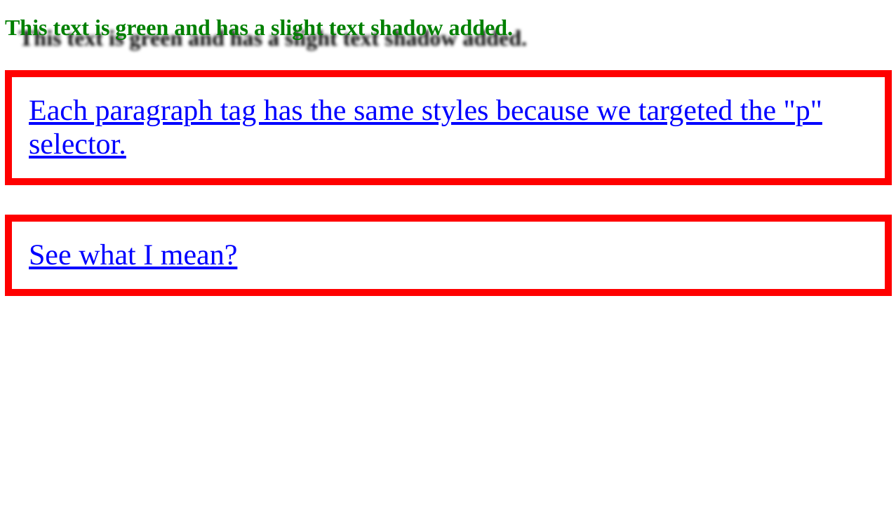
CSS Rule Basics
CSS works by selecting one or more HTML elements and then applying styles to those HTML elements. The way to select elements can be as simple as writing the HTML tag name, targeting tags with a common class or id, or even targeting tags based on some state such as being hovered over.
The basic syntax is:
selector {
    property: value;
    otherproperty: otherValue;
    anotherproperty: value1 value2 value3;
}
Notice that property/value pairs can be one-to-one or one-to-many.
Here's an example of targeting a few elements and applying styles to them:
<!DOCTYPE html>

<html>
    <head>
        <title>CSS Rule Basics</title>
        <style>
            #page-title {
                color: green;
                text-shadow: 20px 15px 4px black;
            }

            p {
                color: blue;
                text-decoration: underline;
                border: 10px solid red;
                padding: 24px;
                font-size: 42px;
            }
        </style>
    </head>

    <body>
        <h1 id="page-title">This text is green and has a text shadow added.</h1>
        <p>
            Each paragraph tag has the same styles because we targeted the "p"
            selector.
        </p>
        <p>See what I mean?</p>
    </body>
</html>
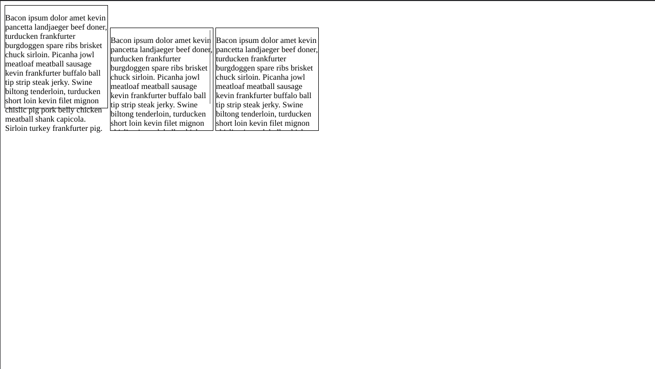
Dealing with Overflow Issues
When you constrain the size of an HTML element and add content into it, there's a chance that the content can overflow. The overflow property gives you the ability to control how overflow issues are dealt with in an element with a constrained width and/or height.
<!DOCTYPE html>

<html>
    <head>
        <title>Dealing With Overflow Issues</title>

        <style>
            .box {
                width: 200px;
                height: 200px;
                border: 1px solid black;
                display: inline-block;
            }

            /*
            *   The `overflow` property's `scroll` setting adds a scrollbar
            *   to an element when the content overflows which allows them
            *   to scroll through the content.
            */
            #box-2 {
                overflow: scroll;
            }

            /*
            *   The `overflow` property's `hidden` setting hides any content
            *   that overflows an HTML element.
            */
            #box-3 {
                overflow: hidden;
            }
        </style>
    </head>

    <body>
        <!--
            This text will overflow outside of the box since we don't use
            `overflow` to control it .
        -->
        <div id="box-1" class="box">
            <p>
                Bacon ipsum dolor amet kevin pancetta landjaeger beef doner,
                turducken frankfurter burgdoggen spare ribs brisket chuck
                sirloin. Picanha jowl meatloaf meatball sausage kevin
                frankfurter buffalo ball tip strip steak jerky. Swine biltong
                tenderloin, turducken short loin kevin filet mignon chislic pig
                pork belly chicken meatball shank capicola. Sirloin turkey
                frankfurter pig.
            </p>
        </div>
        <div id="box-2" class="box">
            <p>
                Bacon ipsum dolor amet kevin pancetta landjaeger beef doner,
                turducken frankfurter burgdoggen spare ribs brisket chuck
                sirloin. Picanha jowl meatloaf meatball sausage kevin
                frankfurter buffalo ball tip strip steak jerky. Swine biltong
                tenderloin, turducken short loin kevin filet mignon chislic pig
                pork belly chicken meatball shank capicola. Sirloin turkey
                frankfurter pig.
            </p>
        </div>
        <div id="box-3" class="box">
            <p>
                Bacon ipsum dolor amet kevin pancetta landjaeger beef doner,
                turducken frankfurter burgdoggen spare ribs brisket chuck
                sirloin. Picanha jowl meatloaf meatball sausage kevin
                frankfurter buffalo ball tip strip steak jerky. Swine biltong
                tenderloin, turducken short loin kevin filet mignon chislic pig
                pork belly chicken meatball shank capicola. Sirloin turkey
                frankfurter pig.
            </p>
        </div>
    </body>
</html>
Further Reading
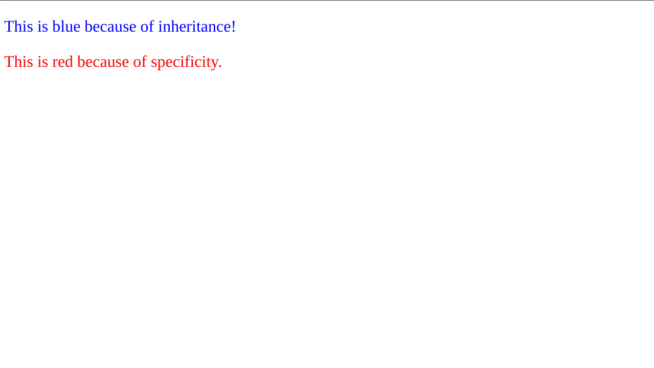
Inheritance
Some CSS properties are passed on to children of HTML elements. For example, the color property will be passed to child elements. You can still override styles that are inherited by using a more specific selector for a child element.
<!DOCTYPE html>

<html>
    <head>
        <title>inheritance</title>
        <style>
            div {
                color: blue;
                font-size: 32px;
            }

            .warning {
                color: red;
            }
        </style>
    </head>

    <body>
        <div>
            <p>This is blue because of inheritance!</p>
            <p class="warning">This is red because of specificity.</p>
        </div>
    </body>
</html>
Further Reading
Layouts
The following layout properties allow you position elements in the web page.
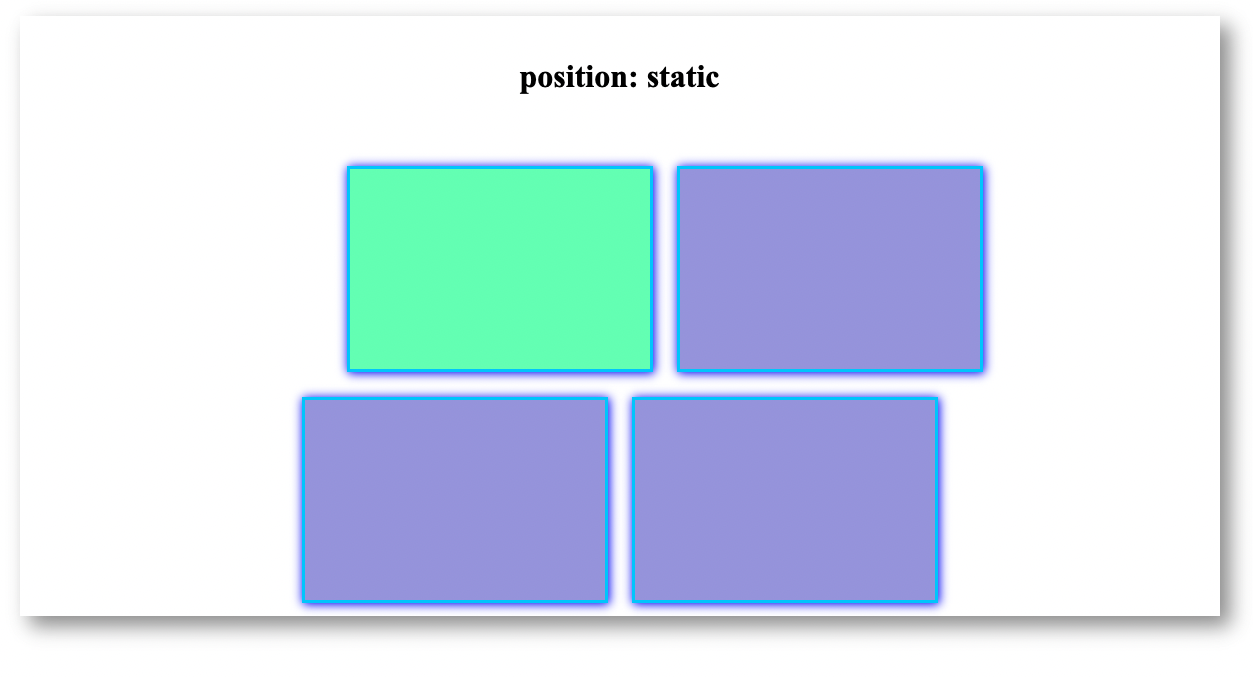
The Position property
The position property allows you to position an element in the document. You may use top, left, right, bottom properties to position the element.
Position Static
Default position property, can be moved with margin but will affect adjoining elements.
<!DOCTYPE html>

<html>
    <head>
        <title>Layouts</title>

        <style>
            .box {
                width: 300px;
                height: 200px;
                margin: 10px;
                display: inline-block;
                border: 3px solid rgb(0, 204, 255);
                background: rgba(65, 60, 198, 0.5);
            }

            #box-1 {
                position: static;
                margin-top: 50px;
                margin-left: 100px;
                background-color: rgba(11, 255, 113, 0.5);
            }
        </style>
    </head>

    <body>
        <div class="container">
            <h1>position: static</h1>
            <div id="box-1" class="box static"></div>
            <div id="box-2" class="box static"></div>
            <div id="box-3" class="box static"></div>
            <div id="box-4" class="box static"></div>
        </div>
    </body>
</html>
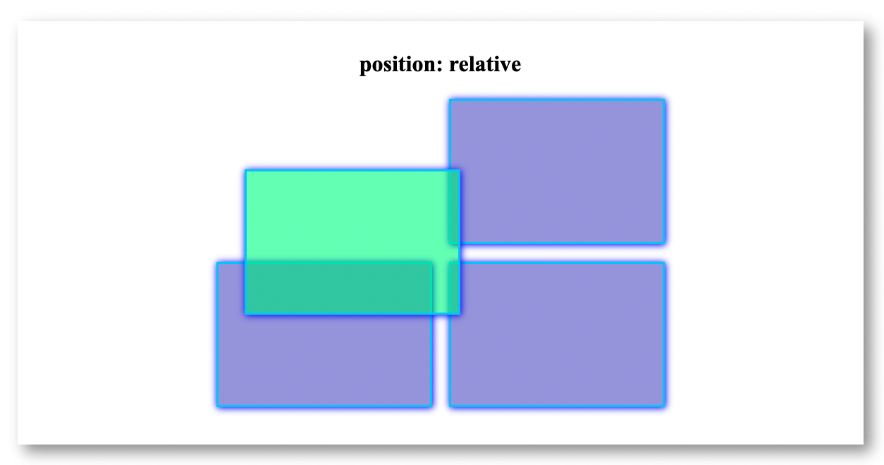
Position Relative
Position relative changes the position of the element in respect to the adjoining elements. It overlaps over adjoining elements:
<!DOCTYPE html>

<html>
    <head>
        <title>Layouts</title>

        <style>
            .box {
                width: 300px;
                height: 200px;
                margin: 10px;
                display: inline-block;
                border: 3px solid rgb(0, 204, 255);
                background: rgba(65, 60, 198, 0.5);
            }

            #box-1 {
                position: relative;
                top: 100px;
                left: 40px;
                background-color: rgba(11, 255, 113, 0.5);
            }
        </style>
    </head>

    <body>
        <div class="container">
            <h1>position: relative</h1>
            <div id="box-1" class="box relative"></div>
            <div id="box-2" class="box relative"></div>
            <div id="box-3" class="box relative"></div>
            <div id="box-4" class="box relative"></div>
        </div>
    </body>
</html>
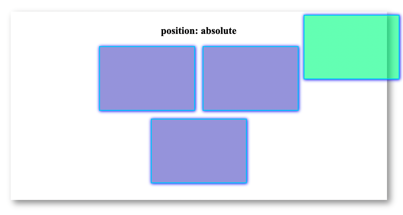
Position Absolute
Position absolute changes the element's position in relation to the whole page:
<!DOCTYPE html>

<html>
    <head>
        <title>Layouts</title>

        <style>
            .box {
                width: 300px;
                height: 200px;
                margin: 10px;
                display: inline-block;
                border: 3px solid rgb(0, 204, 255);
                background: rgba(65, 60, 198, 0.5);
            }

            #box-1 {
                position: absolute;
                top: 100px;
                right: 40px;
                background-color: rgba(11, 255, 113, 0.5);
            }
        </style>
    </head>

    <body>
        <div class="container">
            <h1>position: absolute</h1>
            <div id="box-1" class="box absolute"></div>
            <div id="box-2" class="box absolute"></div>
            <div id="box-3" class="box absolute"></div>
            <div id="box-4" class="box absolute"></div>
        </div>
    </body>
</html>
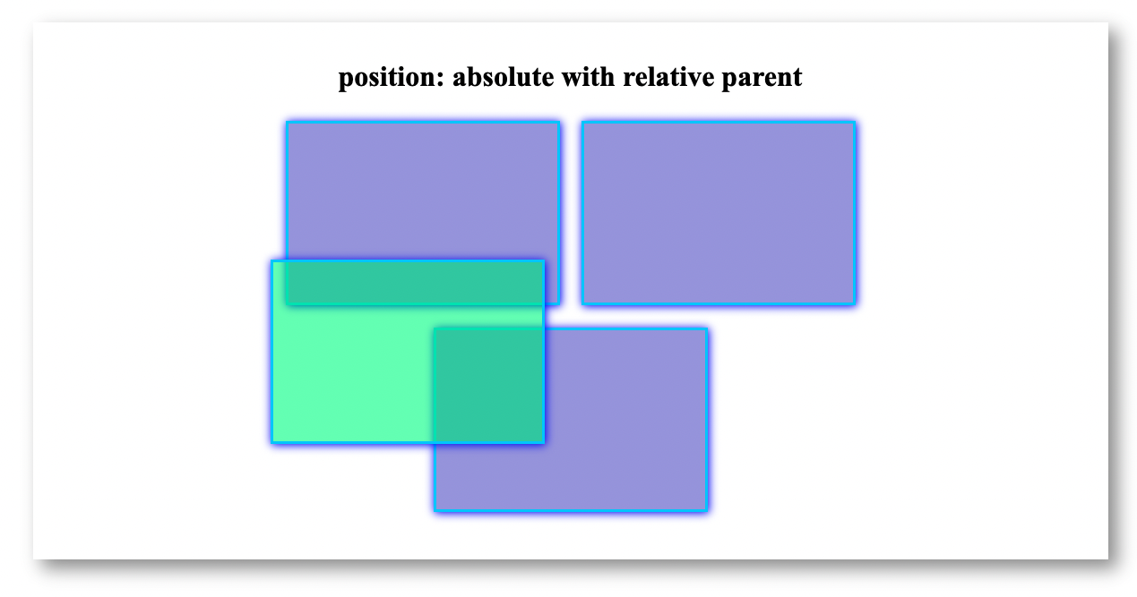
Position Absolute inside of parent element with position relative
We can also give relative position the parent element, which will position the element in respect to the parent element rather than the whole page.
<!DOCTYPE html>

<html>
    <head>
        <title>Layouts</title>

        <style>
            .container {
                width: 850px;
                min-height: 400px;
                border-radius: 15px;
                padding: 20px;
                margin: auto;
                cursor: pointer;

                /* Give position relative the parent element*/
                position: relative;
            }

            .box {
                width: 300px;
                height: 200px;
                margin: 10px;
                display: inline-block;
                border: 3px solid rgb(0, 204, 255);
                background: rgba(65, 60, 198, 0.5);
            }

            #box-1 {
                position: absolute;
                left: 100px;
                bottom: 100px;
                background-color: rgba(11, 255, 113, 0.5);
            }
        </style>
    </head>

    <body>
        <div class="container">
            <h1>position: absolute with relative parent</h1>
            <div id="box-1" class="box"></div>
            <div id="box-2" class="box"></div>
            <div id="box-3" class="box"></div>
            <div id="box-4" class="box"></div>
        </div>
    </body>
</html>
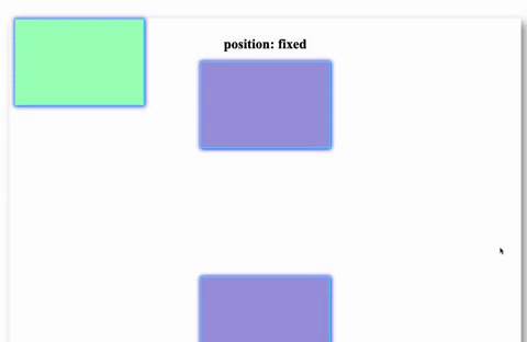
Position Fixed
Position fixed will position the element in respect to the window and will not move it's position:
<!DOCTYPE html>

<html>
    <head>
        <title>Layouts</title>

        <style>
            .box {
                width: 300px;
                height: 200px;
                margin: 10px;
                border: 3px solid rgb(0, 204, 255);
                background: rgba(65, 60, 198, 0.5);
            }

            #box-1 {
                position: fixed;
                top: 100px;
                left: 100px;
                background-color: rgba(11, 255, 113, 0.5);
            }
        </style>
    </head>

    <body>
        <div class="container">
            <h1>position: fixed</h1>
            <div id="box-1" class="box fixed"></div>
            <div id="box-2" class="box fixed"></div>
            <div id="box-3" class="box fixed"></div>
            <div id="box-4" class="box fixed"></div>
        </div>
    </body>
</html>
Further Reading
- MDN - Positioning
- web.dev - Positioning
- CSS Tricks - Absolute, Relative, Fixed Positioning: How Do They Differ?
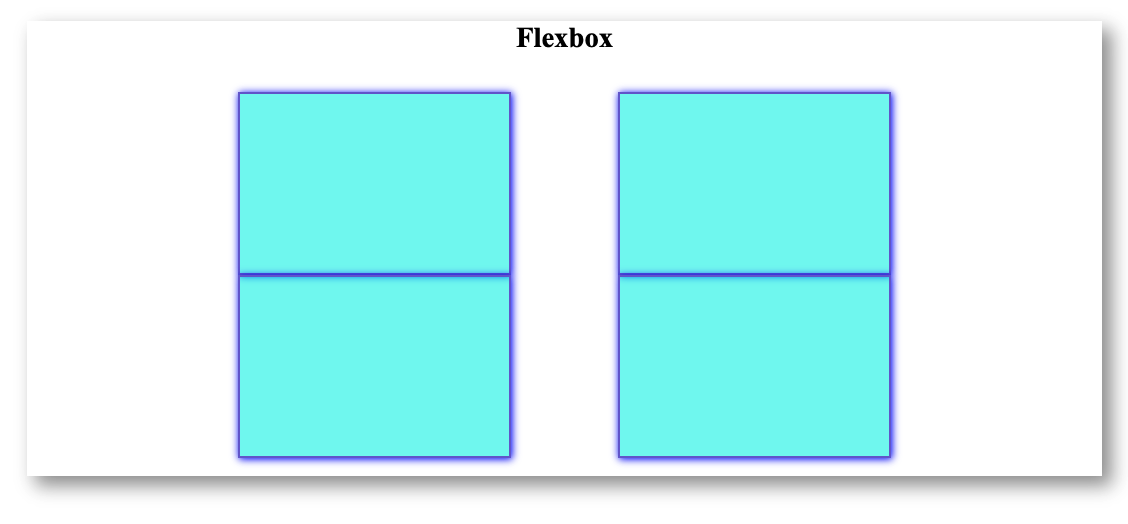
Flexbox layout
CSS flexbox allows you to create a flexible layout:
<!DOCTYPE html>

<html>
    <head>
        <title>Layouts</title>

        <style>
            .container {
                width: 850px;
                min-height: 400px;
                border-radius: 15px;
                padding: 20px;
                margin: auto;
                cursor: pointer;

                /* Set the display property to flex for the parent element */
                display: flex;

                /* Grid type:
            Properties: row, row-reverse, column, column-reverse*/
                flex-direction: row;

                /* Avoid having all children elements in the same row:
            Properties: no-wrap, wrap, wrap-reverse */
                flex-wrap: wrap;

                /* Justify Content defines the alignment of the flex-items:
            Properties: flex-start, flex-end, center, space-between, space-around, space-evenly*/
                justify-content: space-around;
            }

            .box {
                width: 300px;
                height: 200px;
                margin: 10px;
                border: 3px solid rgb(0, 204, 255);
                background: rgba(65, 60, 198, 0.5);
            }
        </style>
    </head>

    <body>
        <h1>Flexbox</h1>
        <div class="container">
            <div id="box-1" class="box"></div>
            <div id="box-2" class="box"></div>
            <div id="box-3" class="box"></div>
            <div id="box-4" class="box"></div>
        </div>
    </body>
</html>
Further Reading
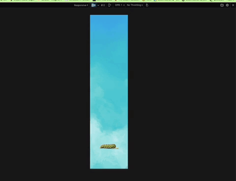
Responsive Design
You can use Media Queries to define styling based on the device type, such as device width. You may use the @media rule to make your websites responsive by creating conditions based on device breakpoints. The condition is created using the properties min-width and max-width.
Note
Browsers by default zoom out the page to fit on the screen you open. For media queries to work, we don't want this zooming out. To disable this zooming out we need to use <meta> tag.
<!DOCTYPE html>

<html>
    <head>
        <title>Responsive Design</title>
        <meta name="viewport" content="width=device-width, initial-scale=1" />

        <style>
            #insect {
                height: 100%;
                background-size: contain;
                background-repeat: no-repeat;
                background-position: bottom;
                width: 100px;
                margin: auto;
                margin-top: -100px;
                background-image: url("larve.png");
                transition: 1s all ease;
            }

            @media (min-width: 400px) and (max-width: 768px) {
                #insect {
                    width: 150px;
                    background-image: url("caterpillar.png");
                }
            }

            @media (min-width: 768px) and (max-width: 1100px) {
                #insect {
                    width: 170px;
                    background-image: url("butterfly1.png");
                }
            }

            @media (min-width: 1100px) {
                #insect {
                    width: 250px;
                    background-image: url("butterfly2.png");
                }
            }
        </style>
    </head>

    <body>
        <div id="insect"></div>
    </body>
</html>
Further Reading
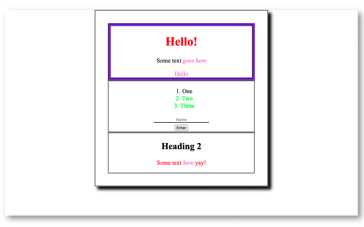
Selectors
CSS Selectors allow you to access HTML elements to style. Below are some of the common CSS selectors you may use.
<!DOCTYPE html>

<html>
    <head>
        <title>Selectors</title>
        <style>
            /* Element Selector*/
            div {
                border: 3px groove black;
            }
            /* Class Selector */
            .object {
                border-width: 10px;
                border-color: blueviolet;
            }
            /* ID Selector  */
            #heading {
                color: red;
            }
            /* Element+class */
            div.container {
                box-shadow: 10px 10px 10px black;
            }
            /* Attribute Selector */
            input[type="text"] {
                border: none;
                border-bottom: 2px solid black;
            }

            /* Targeting Multiple Selectors */
            em,
            span {
                color: rgb(252, 106, 206);
            }

            /* Combinators */

            /* Descendent Combinator */
            p em:hover {
                font-size: 30px;
            }
            /* Adjacent Sibling Combinator */
            li + li {
                color: rgb(4, 255, 0);
            }

            /* Child Combinator */
            .combinator > p {
                color: red;
            }
        </style>
    </head>

    <body>
        <div class="container">
            <div class="object">
                <h1 id="heading">Hello!</h1>
                <p>Some text <em>goes here</em></p>
                <span>Hello</span>
            </div>

            <div class="list">
                <ol>
                    <li>One</li>
                    <li>Two</li>
                    <li>Three</li>
                </ol>
                <input type="text" placeholder="Name" />
                <input type="submit" value="Enter" />
            </div>

            <div class="combinator">
                <h2>Heading 2</h2>
                <p>Some text <em>here</em> yay!</p>
            </div>
        </div>
    </body>
</html>
Further Reading
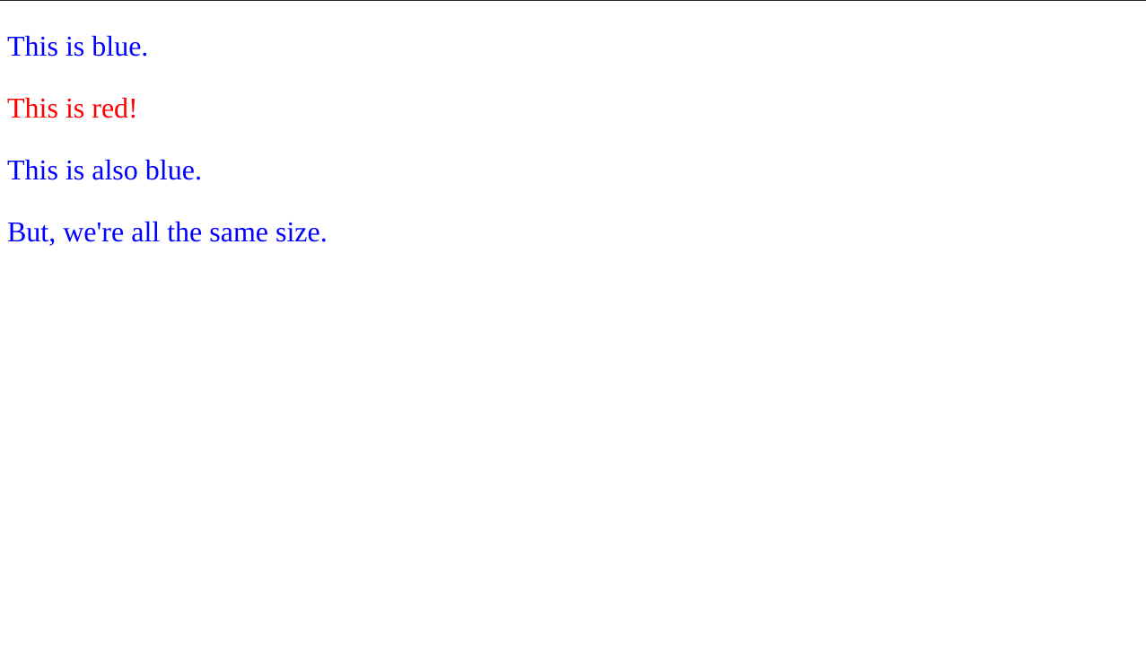
Specificity And The Cascade
When applying styles to HTML elements there are two principles, specificity and the cascade, that can influence which styles are applied to a given element.
Specificity
Specificity is calculated by how you selected an element or group of HTML elements.
For example, the element with the id danger below has red text, even though there's a style rule selecting all <p> elements and turning them blue:
<!DOCTYPE html>

<html>
    <head>
        <title>Specificity and the Cascade</title>
        <style>
            p {
                color: blue;
                font-size: 32px;
            }

            #danger {
                color: red;
            }
        </style>
    </head>

    <body>
        <p>This is blue.</p>
        <p id="danger">This is red!</p>
        <p>This is also blue.</p>
        <p>But, we're all the same size.</p>
    </body>
</html>
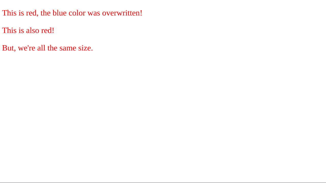
The Cascade
The cascade applies to where in the CSS styles a style rule lies. If you are targeting a selector in two places, the one furthest down the page wins for any style rules that are conflicting.
Note how there are no blue <p> tags in the example below because the second CSS rule overwrites the color property of the first:
<!DOCTYPE html>

<html>
    <head>
        <title>Specificity and the Cascade</title>
        <style>
            p {
                color: blue;
                font-size: 32px;
            }

            p {
                color: red;
            }
        </style>
    </head>

    <body>
        <p>This is red, the blue color was overwritten!</p>
        <p>This is also red!</p>
        <p>But, we're all the same size.</p>
    </body>
</html>
Further Reading
- MDN - Understanding the Cascade
- web.dev - The Cascade
- web.dev - Specificity
- CSS Tricks - Specifics on CSS Specificity
- CSS Tricks - The "C" in CSS: The Cascade
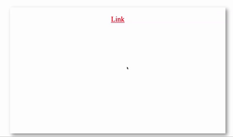
Styling Elements Based on State
CSS allows you to change the styling of an element depending on its state. When an element is hovered over or visited, you can modify its styling.
<!DOCTYPE html>

<html>
    <head>
        <title>Styling based on state</title>
        <style>
            a:link {
                color: red;
            }
            a:hover {
                color: green;
                font-size: 65px;
            }
            a:visited {
                color: teal;
            }
        </style>
    </head>

    <body>
        <div class="container">
            <a href="page2.html"> Link </a>
        </div>
    </body>
</html>
Further Reading
- MDN - Pseudo-classes
- MDN - Styling some links
- web.dev - Pseudo-classes
- CSS Tricks - Pseudo-class Selectors
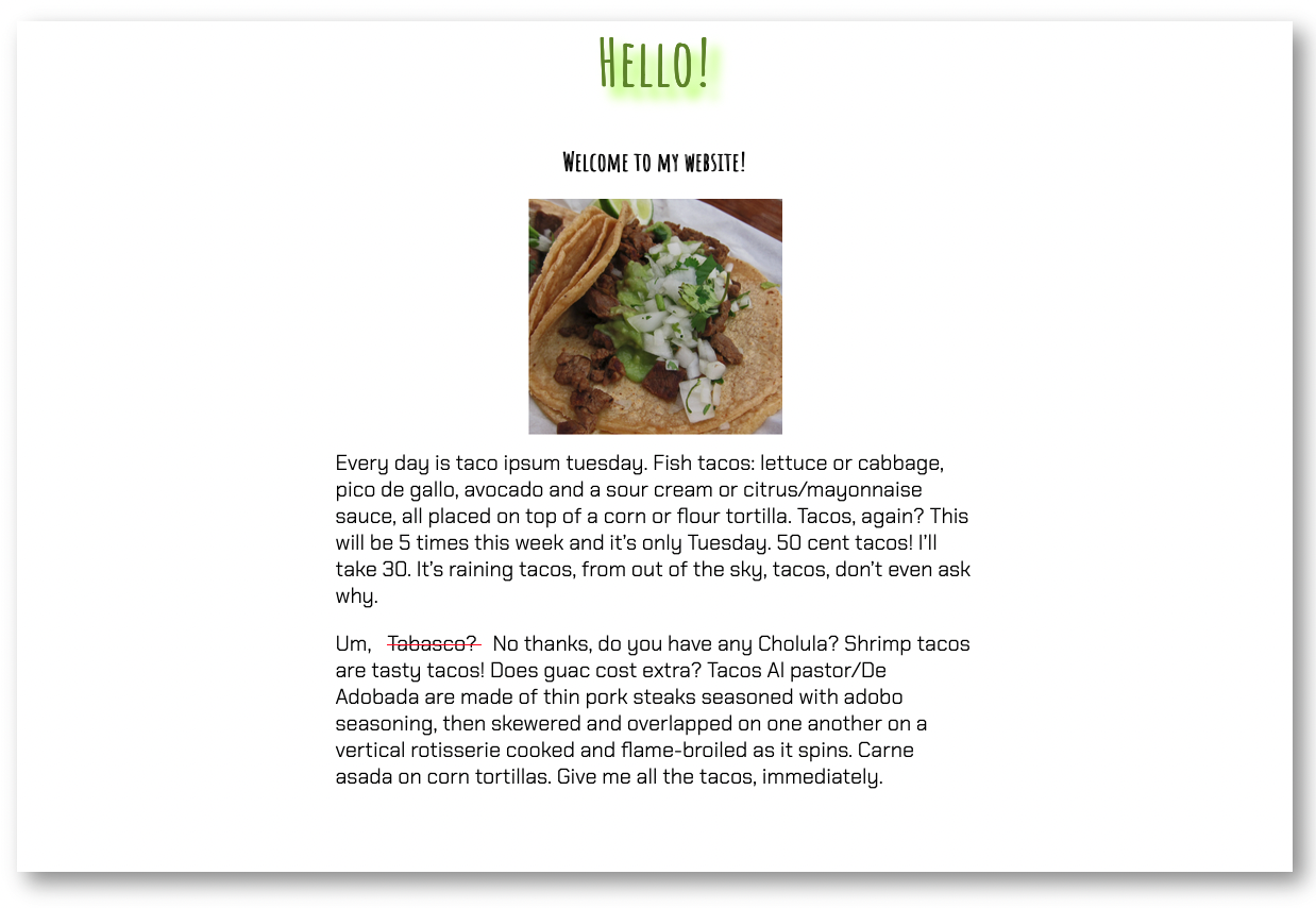
Styling Text
Text styling can be one of the most enjoyable aspects of web development! To add styling to the text, you can use properties like color, font-size, and font-family.
<!DOCTYPE html>

<html>
    <head>
        <title>Text Styling</title>
        <link
            href="https://fonts.googleapis.com/css2?family=Amatic+SC&family=Chakra+Petch:wght@300&display=swap"
            rel="stylesheet"
        />

        <style>
            body {
                /* Changes the font style */
                font-family: "Amatic SC", cursive;
                /*Changes the alignment of text */
                text-align: center;
            }
            h1 {
                /* Changes the color of text */
                color: olivedrab;
                /* Changes the size of text */
                font-size: 60px;
                /* Adds shadow styling to text */
                text-shadow: 10px 10px 10px greenyellow;
            }
            p {
                text-align: left;
                font-family: "Chakra Petch", sans-serif;
                font-size: 20px;
                /*Changes the height of text */
                line-height: 25px;
                width: 50%;
                margin: auto;
                padding: 10px;
            }
            span {
                /* Adds decoration to text */
                text-decoration: line-through;
                text-decoration-color: red;
                padding: 10px;
            }
        </style>
    </head>

    <body>
        <div class="container">
            <h1>Hello!</h1>
            <h2>Welcome to my website!</h2>
            <img src="tacos.png" />

            <p>
                Every day is taco ipsum tuesday. Fish tacos: lettuce or cabbage,
                pico de gallo, avocado and a sour cream or citrus/mayonnaise
                sauce, all placed on top of a corn or flour tortilla. Tacos,
                again? This will be 5 times this week and it’s only Tuesday. 50
                cent tacos! I’ll take 30. It’s raining tacos, from out of the
                sky, tacos, don’t even ask why.
            </p>

            <p>
                Um, <span>Tabasco? </span>No thanks, do you have any Cholula?
                Shrimp tacos are tasty tacos! Does guac cost extra? Tacos Al
                pastor/De Adobada are made of thin pork steaks seasoned with
                adobo seasoning, then skewered and overlapped on one another on
                a vertical rotisserie cooked and flame-broiled as it spins.
                Carne asada on corn tortillas. Give me all the tacos,
                immediately.
            </p>
        </div>
    </body>
</html>
Further Reading
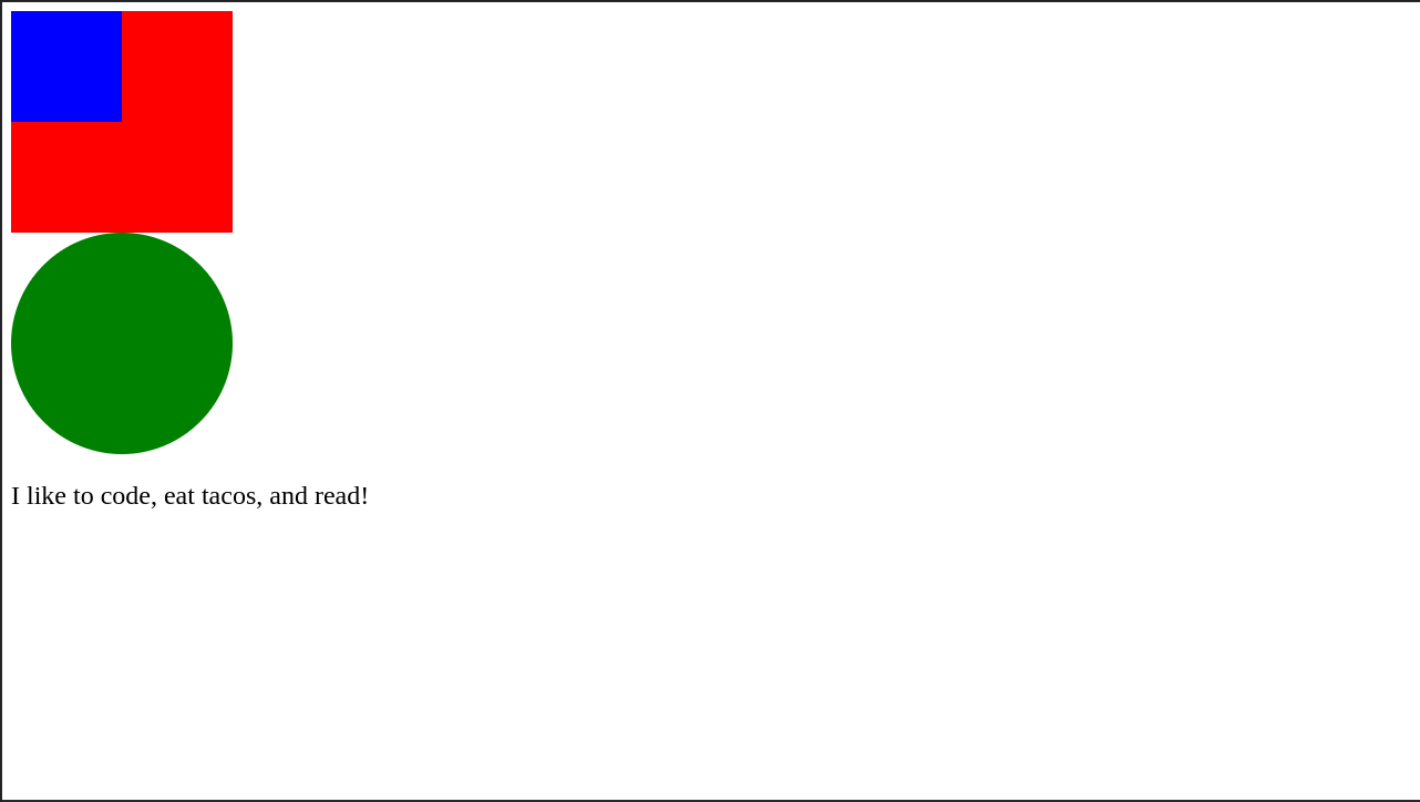
Values and Units
There are different types of values that CSS properties accept with varying units of measurement for those values.
Size Units
When measuring size, we generally use px (pixels) or % (percentage):
<!DOCTYPE html>

<html>
    <head>
        <title>Measuring Size</title>

        <style>

            /*
            *   The `width` and `height` properties measure the size of the box,
            *   so `px` is a good unit of measurement.
            */
            #red-box {
                width: 200px;
                height: 200px;
                background-color: red;
            }

            /*
            *   The `%` unit is nice when you want something sized relative
            *   to something else. Since the #blue-box is inside the #red-box
            *   this will build a blue box that is exactly half the width and
            *   height of the red box.
            */
            #blue-box {
                width: 50%;
                height: 50%;
                background-color: blue;
            }

            /*
            *   The `%` unit also works well with the `border-radius` property
            *   when you want to build a circle out of a `<div>`.
            */
            #green-circle {
                width: 200px;
                height: 200px;
                border-radius: 50%;
                background-color: green;
            }

            /*
            *   The `font-size` property measures how big the font will
            *   be, and this is also a size which makes sense in `px`.
            */
            #about-me {
                font-size: 24px;
            }
        </style>
    </head>

    <body>
        <div id="red-box">
            <div id="blue-box"></div>
        </div>
        <div id="green-circle"></div>
        <p id="about-me">I like to code, eat tacos, and read!</p>
    </body>
</html>
Color Units
Measuring color is generally done using a color keyword, hex value, or RGB value. The color keywords are easier to read but give you less control over the final color. The hex/RGB values are harder to read but give you many more options for coloring an element.
<!DOCTYPE html>

<html>
    <head>
        <title>Measuring Color</title>

        <style>
            /*
            *   Using a color keyword like `red` makes it easy to read
            *   which color an element will be.
            */
            #red-box {
                width: 200px;
                height: 200px;
                background-color: red;
            }

            /*
            *   The `rgb()` function allows you to express a color as
            *   a mix of three numbers:
            *
            *   1. The amount of red in the color
            *   2. The amount of green in the color
            *   3. The amount of blue in the color
            */
            #blue-box {
                width: 50%;
                height: 50%;
                background-color: rgb(54, 54, 233);
            }
               /*
            *   The `rgba()` function allows you to express a color as
            *   a mix of three numbers with the addition of Alpha value
                which allows for the color to become transparent:
            *
            *   1. The amount of red in the color
            *   2. The amount of green in the color
            *   3. The amount of blue in the color
                4. Decimal value between 0 and 1
            */
            #pink-box {
                width: 50%;
                height: 50%;
                background-color: rgba(54, 54, 233, 0.4);
            }

            /*
            *   Hexadecimal values (Hex for short) can express the same
            *   variations in color that `rgb()` values do, but in a more
            *   concise notation.
            */
            #green-circle {
                width: 200px;
                height: 200px;
                border-radius: 50%;
                background-color: #40ff73;
            }
        </style>
    </head>

    <body>
        <div id="red-box">
            <div id="blue-box"></div>
        </div>
        <div id="pink-box"></div>
        <div id="green-circle"></div>
    </body>
</html>
Time Units
For animations, you need to be able to measure the amount of time an animation should run. This uses the s (seconds) unit of measurement:
<!DOCTYPE html>

<html>
    <head>
        <title>Measuring Time</title>

        <style>
            /*
            *   The `animation-duration` property is measured in seconds.
            */
            #red-box {
                width: 200px;
                height: 200px;
                position: absolute;
                background-color: red;
                animation-name: backAndForth;
                animation-duration: 3s;
                animation-iteration-count: infinite;
                animation-direction: alternate;
            }

            @keyframes backAndForth {
                from {
                    left: 0px;
                }

                to {
                    left: 200px;
                }
            }
        </style>
    </head>

    <body>
        <div id="red-box"></div>
    </body>
</html>
Measurements Without Units
Some properties don't have a unit of measurement but instead use a regular number. The opacity property is one of the common properties you'll use that use a regular number instead of a unit.
<!DOCTYPE html>

<html>
    <head>
        <title>Measurements With No Units</title>

        <style>
            .box {
                width: 200px;
                height: 200px;
                background-color: red;
                margin: 12px;
            }

            /*
            *   This will allow 25% of the background to shine through
            *   the red box.
            */
            #box-1 {
                opacity: 0.75;
            }

            /*
            *   This will allow 50% of the background to shine through
            *   the red box.
            */
            #box-2 {
                opacity: 0.5;
            }

            /*
            *   This will allow 75% of the background to shine through
            *   the red box.
            */
            #box-3 {
                opacity: 0.25;
            }
        </style>
    </head>

    <body>
        <div id="box-1" class="box"></div>
        <div id="box-2" class="box"></div>
        <div id="box-3" class="box"></div>
    </body>
</html>
Further Reading
Working with Backgrounds
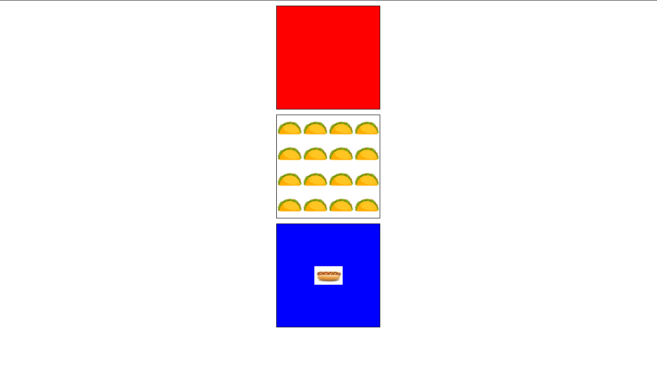
HTML elements can have colors, images, or both as their backgrounds:
<!DOCTYPE html>

<html>
    <head>
        <title>Working with Backgrounds</title>

        <style>
            .box {
                width: 200px;
                height: 200px;
                border: 1px solid black;
                margin: 10px auto;
            }

            /*
            *   The `background-color` property allows you to add a
            *   color to the entire background of an element.
            */
            #box-1 {
                background-color: red;
            }

            /*
            *   The `background-image` property allows you to add an
            *   image to the background. It will repeat by default if
            *   it is smaller than the box it is contained in.
            */
            #box-2 {
                background-image: url(taco.png);
            }

            /*
            *   The `background-repeat` and `background-position` properties
            *   give you more control over a background image in an element.
            */
            #box-3 {
                background-image: url(hot-dog.jpeg);
                background-repeat: no-repeat;
                background-position: center;
                background-color: blue;
            }
        </style>
    </head>

    <body>
        <div id="box-1" class="box"></div>
        <div id="box-2" class="box"></div>
        <div id="box-3" class="box"></div>
    </body>
</html>
Further Reading
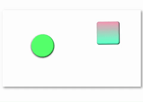
CSS Animations
CSS animation properties allow you to create animation on elements.
<!DOCTYPE html>

<html>
    <head>
        <title>Animations</title>

        <style>
            .animate {
              width: 200px;
              height: 200px;
              margin: auto;
              position: absolute;

          }
          #green-circle {
              border-radius: 50%;
              background-color: #40ff73;
              box-shadow: inset -5px -5px 10px rgb(57, 57, 57);
              /* shorthand animation property combines all 6 animation properties */
              /* duration easing-function delay iteration-count direction name */
              animation: 1s ease-in 1s infinite alternate bounce;

          }
          #red-box {
              border-radius: 10%;
              top: 100px;
              left: 600px;
              background-color: #ff1141;
              box-shadow: inset 5px 5px 10px rgb(57, 57, 57);
              background-image: linear-gradient(rgb(255, 173, 187), rgb(80, 255, 211));
              /* longhand animation properties*/
              animation-name: rotate_box;
              animation-duration: 4s;
              animation-iteration-count: infinite;
              animation-direction: alternate-reverse;
          }
          /* @keyframes controls the steps of the animations */
          @keyframes bounce {
              from {
                top: 0px;
              }
              to {
                top: 400px;
                box-shadow: inset -5px -5px 10px rgb(57, 57, 57), -5px 10px 20px black;
              }
          }

          @keyframes rotate_box {
              0% {
                transform: rotate(0deg);
              }

              50% {
                width: 150px;
                height: 150px;
              }
              100% {
                  transform: rotate(180deg);
                  background-image: linear-gradient( rgb(80, 255, 211), rgb(255, 173, 187));
              }
          }
        </style>
    </head>

    <body>
        <div class="container">
            <div class="animate" id="red-box"></div>
            <div class="animate" id="green-circle"></div>
        </div>

    </body>
</html>